Time+Space
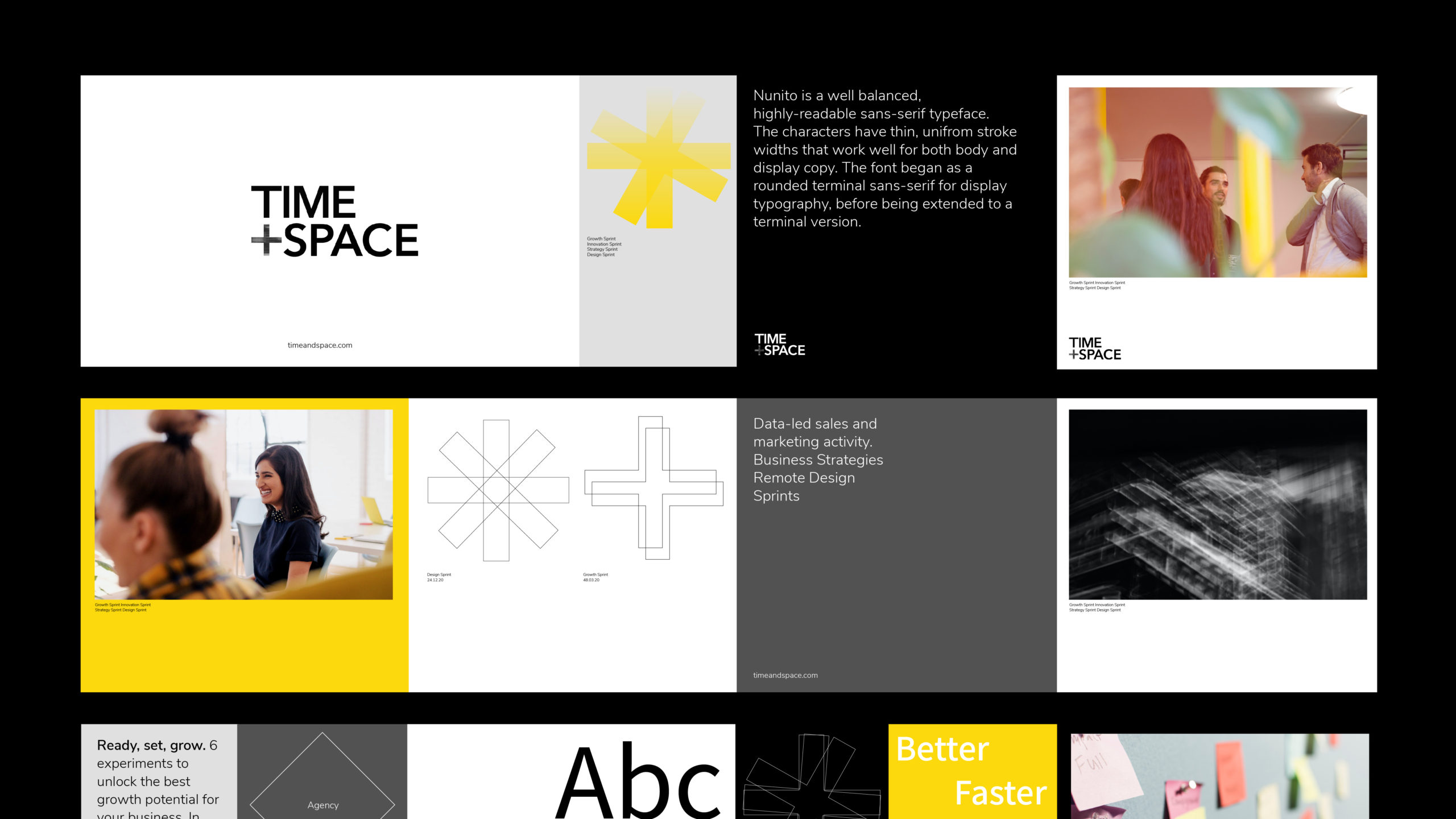
Visual Identity design for a team intent on delivering human-only innovation, enabled by technology.
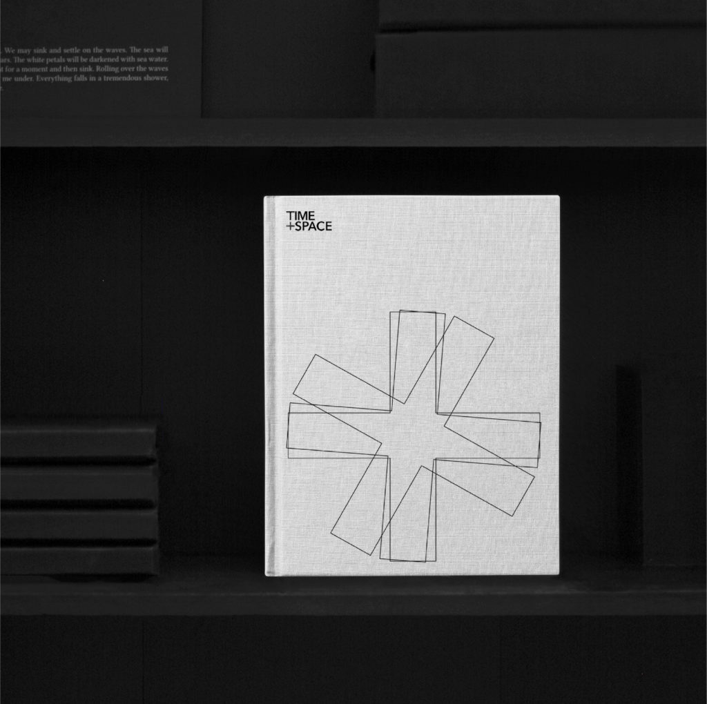

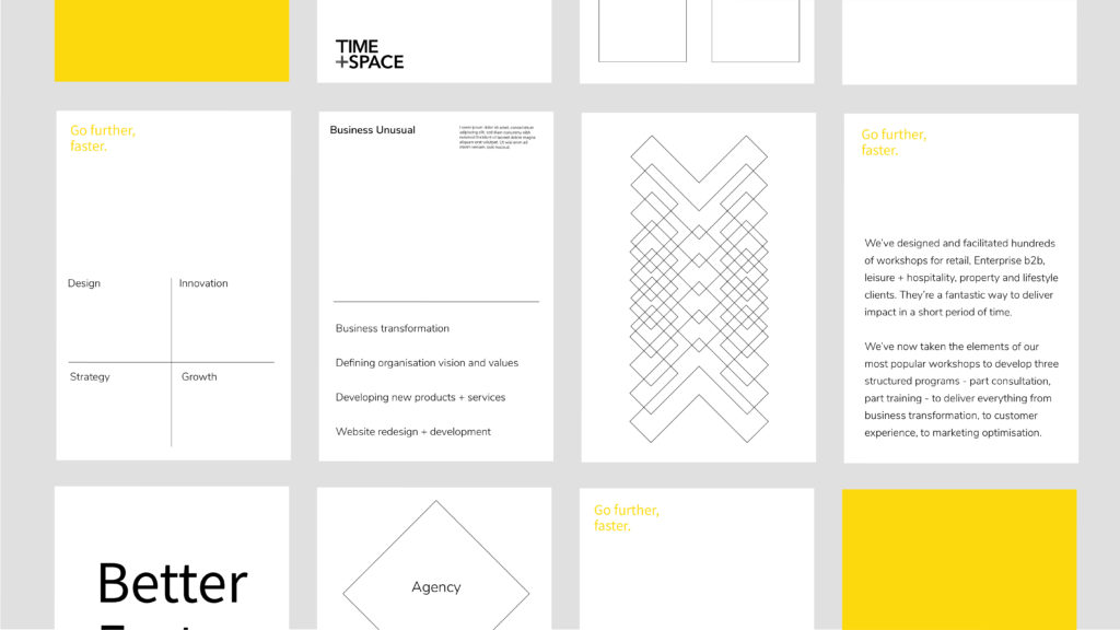
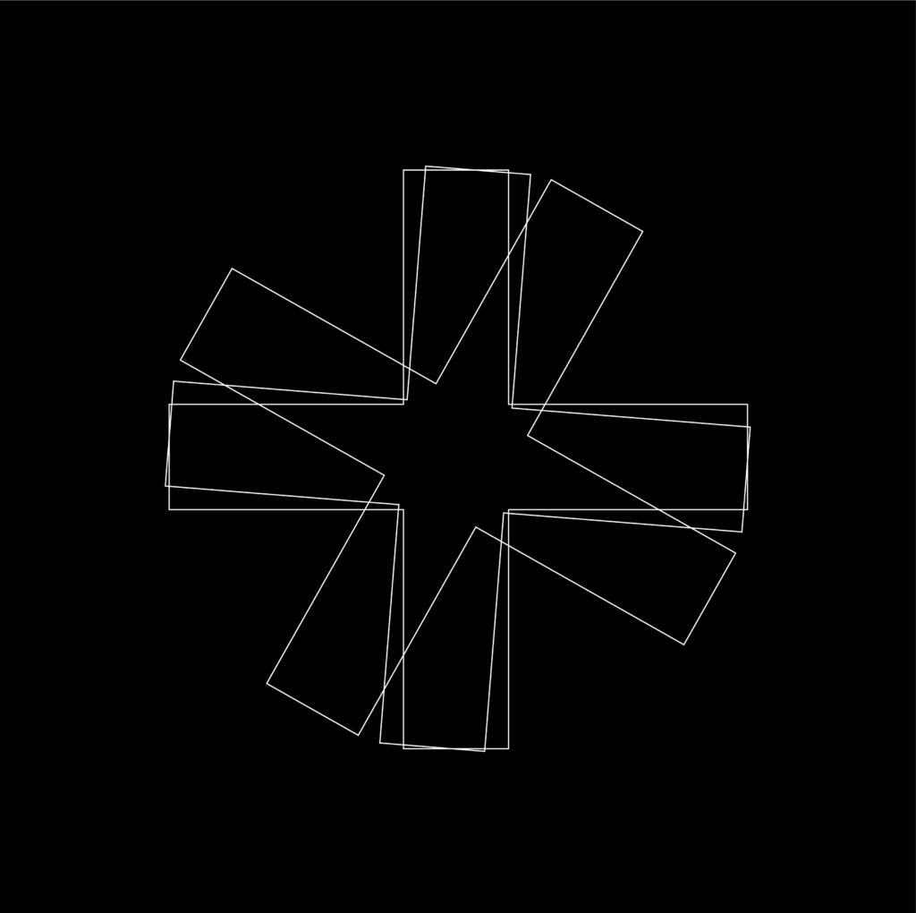
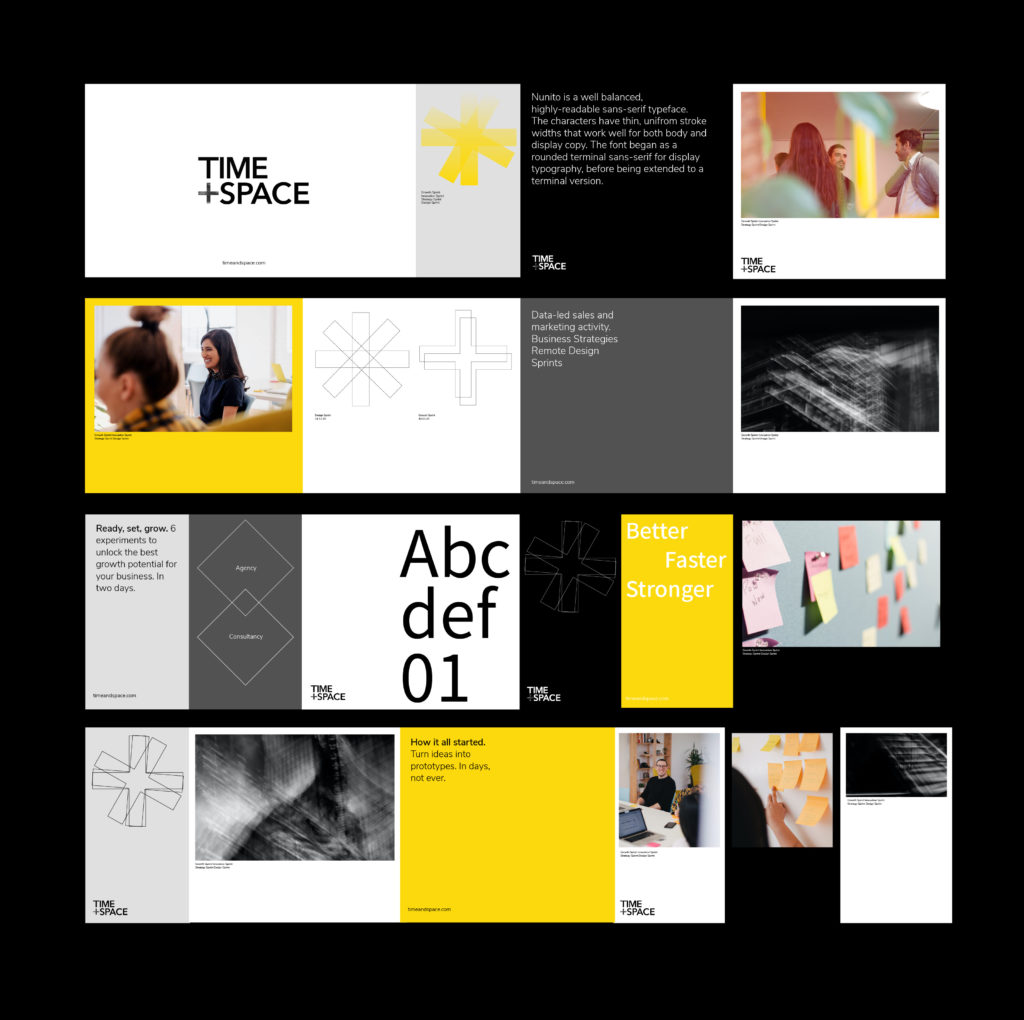
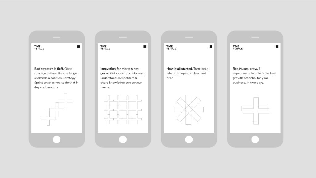
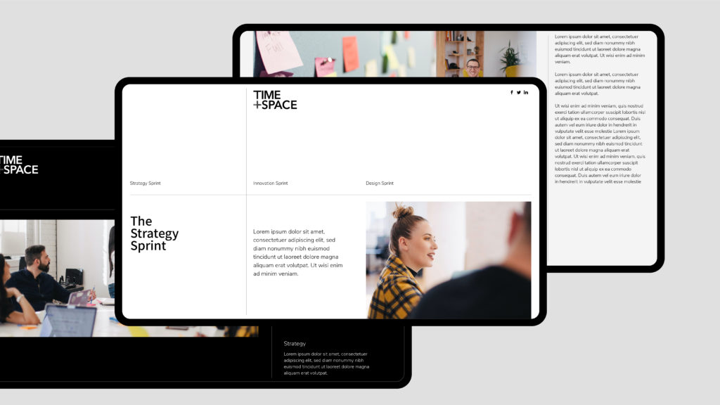
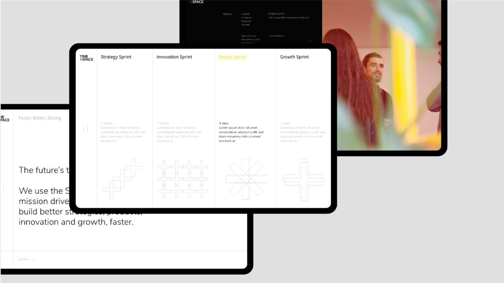
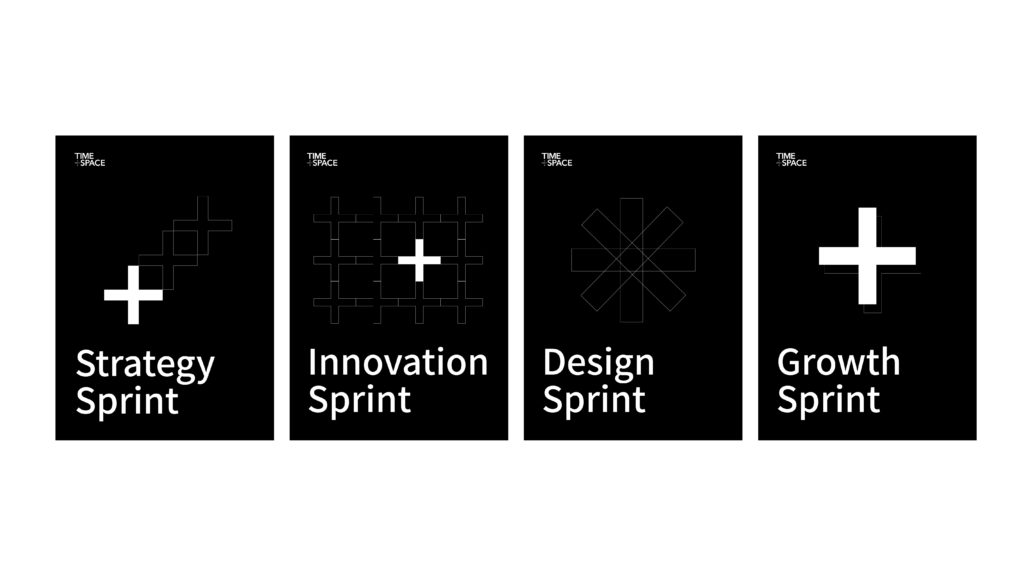
I have recently had the pleasure of designing the brand visual language for Time + Space studio. Time + Space use the sprint methodology to guide mission driven mid-sized businesses to build better strategies, products, innovation and growth, faster. The language was designed around the plus symbol – with the notion of ‘time’ being the horizontal line and ‘space’ being the vertical. The symbol is echoed in patterns that are representative of the brands services with an overall aspirational brand look that is suited for a fast growing and collaborative world.
The vibrant yellow encourages the language to move with purpose and pace, calling for attention from forward thinking and ambitious companies who intend to overcome big challenges and do more work that matters.